Brand Naming | Logo | Visual Identity | Website Development / Marketing
Griffendo
More Than Cybersecurity. It Is Cyber Resilience.
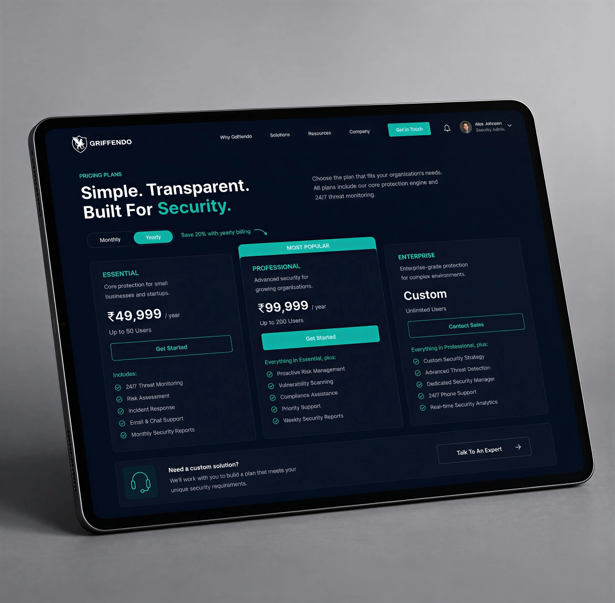
A company set out to build a B2B cybersecurity brand in an already crowded, jargon-heavy space. The challenge ahead of us was to create a name and visual identity that felt strong and memorable, and clearly communicated protection, intelligence, and technological authority without feeling generic or fear-driven. We were also tasked with building the brand’s website, which would become its face online.
THE APPROACH
We explored the idea of guardianship — not just defence, but vigilant and proactive protection of the digital realm. Drawing from mythology, we anchored the brand in the symbolism of the Griffin, a creature known for guarding treasures and sacred spaces. This gave us a powerful conceptual space to position Griffendo as a modern-day protector of cyberspace — alert, resilient, and always on watch. We knew we wanted something that could work just as well in digital space as it would in print.
The solution
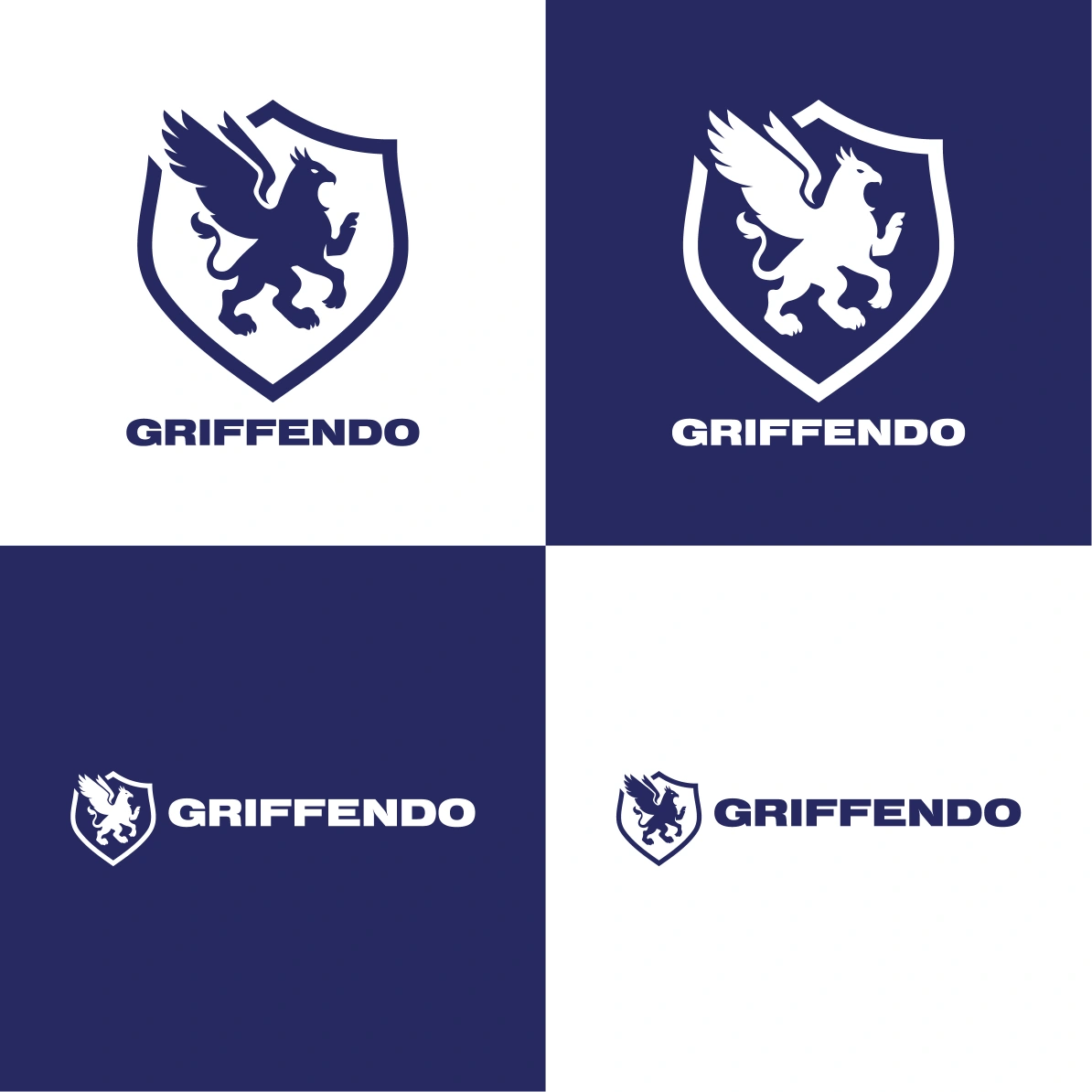
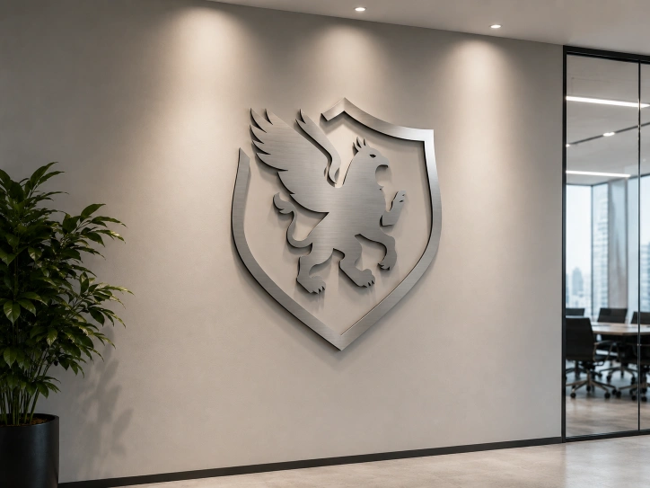
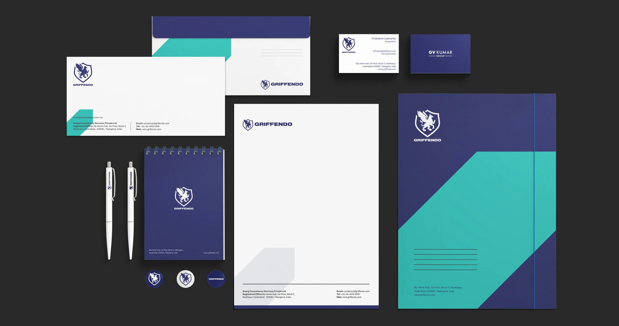
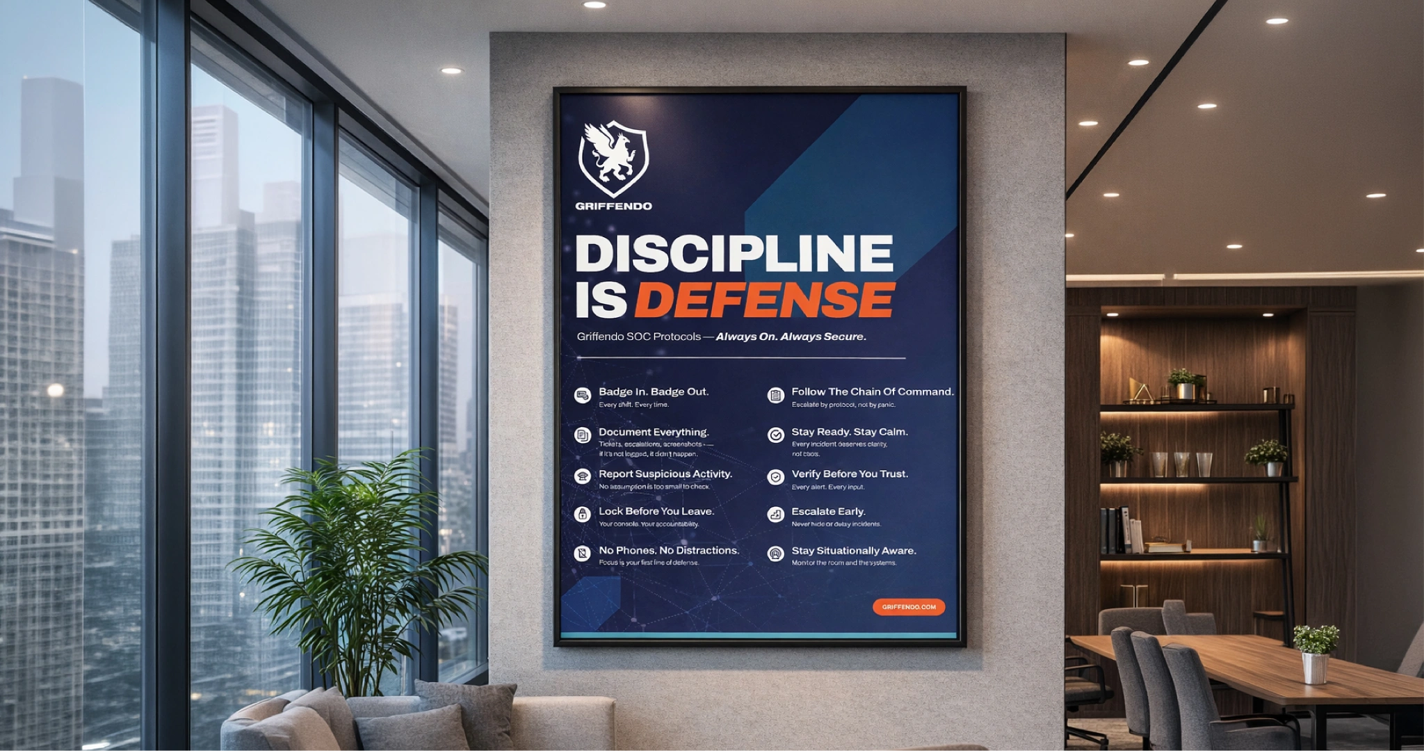
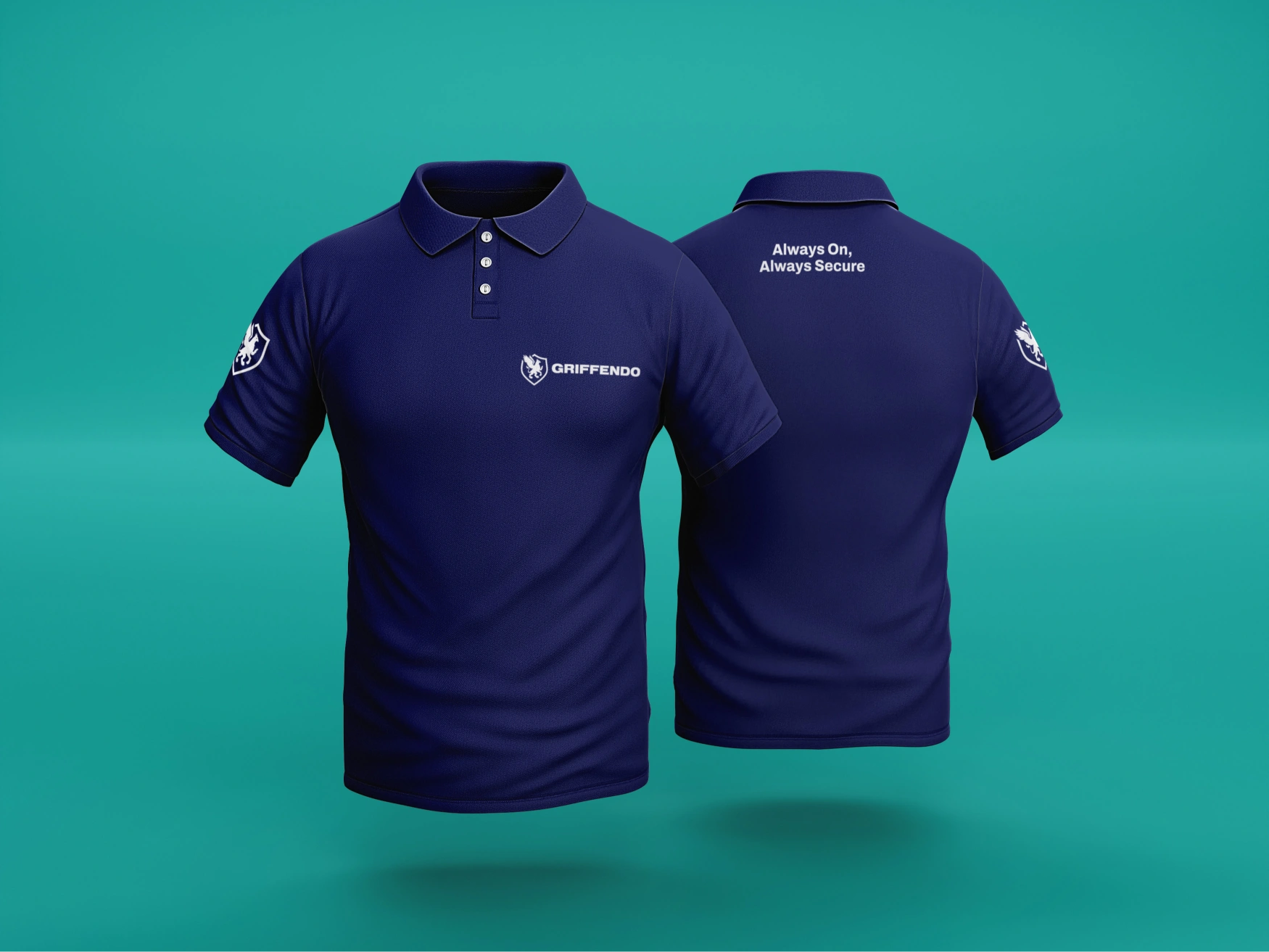
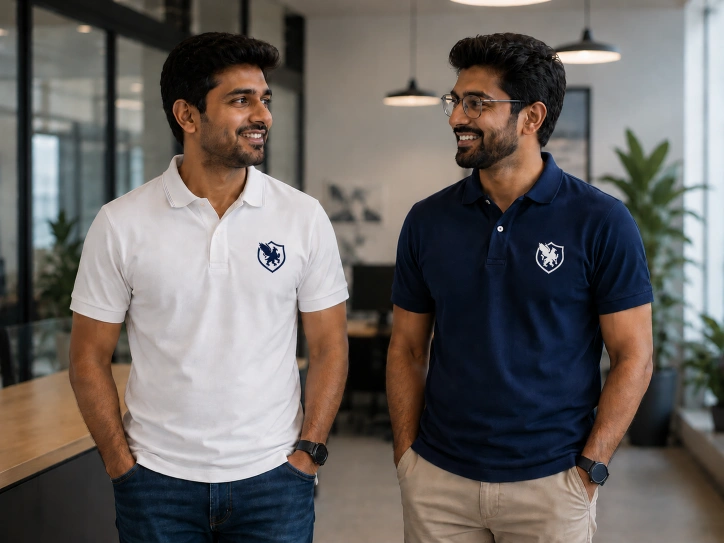
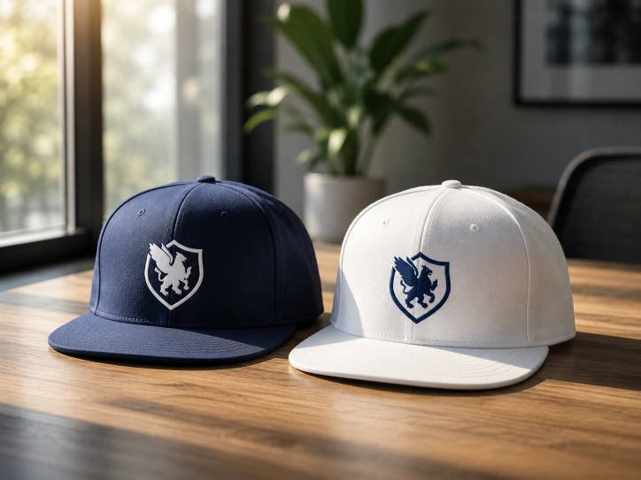
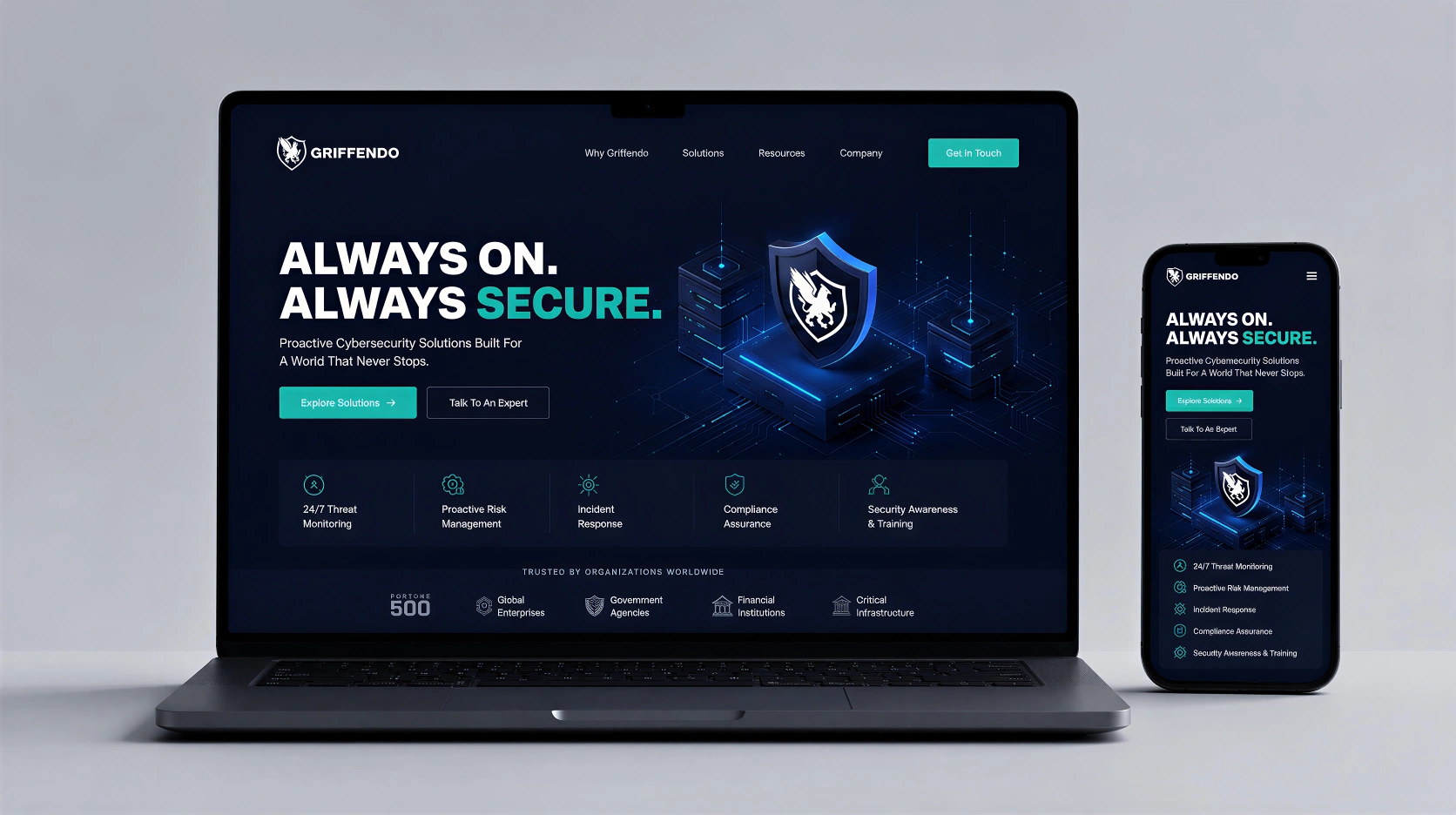
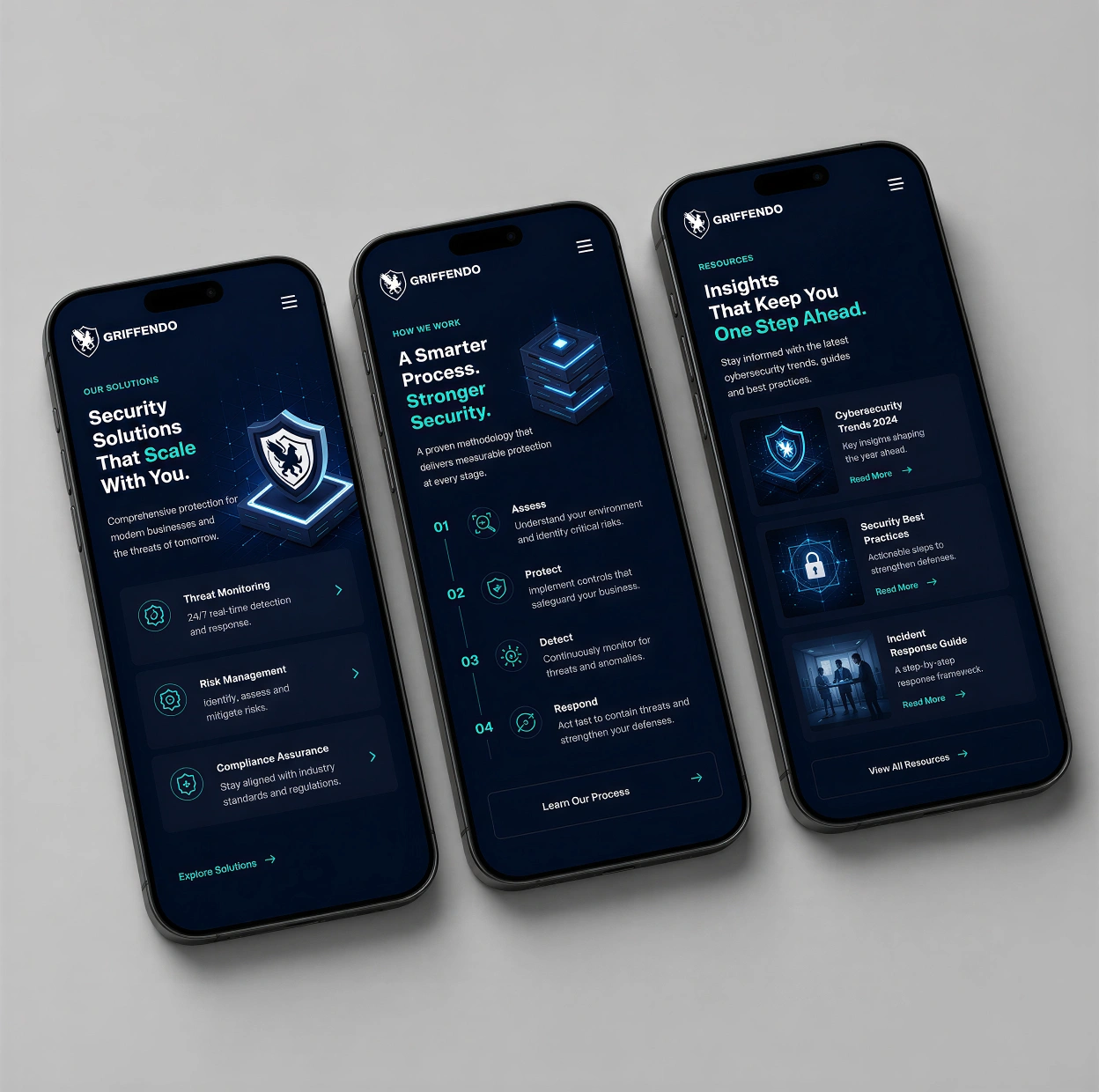
We coined the name Griffendo, a direct homage to the Griffin, evoking strength, vigilance, and defence. The logo brings this idea to life through a fusion of the eagle and lion – intelligence and power – housed within a shield to reinforce security and trust. The visual identity was completed with a sharp, tech-forward colour palette and structured design language, giving the brand a confident, contemporary presence that delivers exactly what the brief demanded: protection, clarity, and credibility. Having locked down the brand’s identity, we then created a sleek and modern website for the brand that clearly highlighted its value proposition, USPs, and services.