Palliative care is still a relatively unfamiliar concept in India – often misunderstood or surrounded by discomfort. The challenge was to craft a brand identity that felt trustworthy, empathetic, and inviting – one that could speak to both emotional sensitivity and medical professionalism.
THE APPROACH
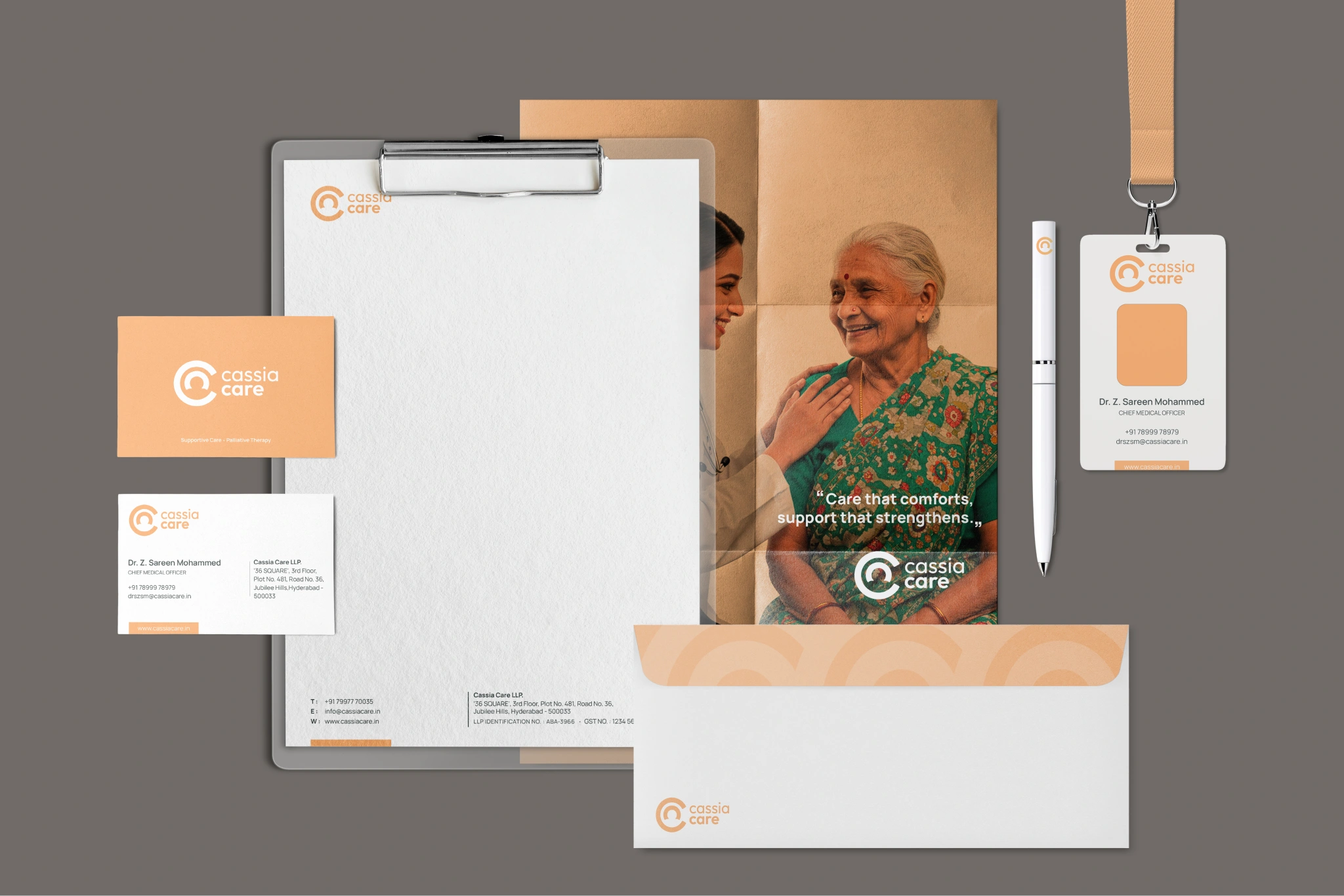
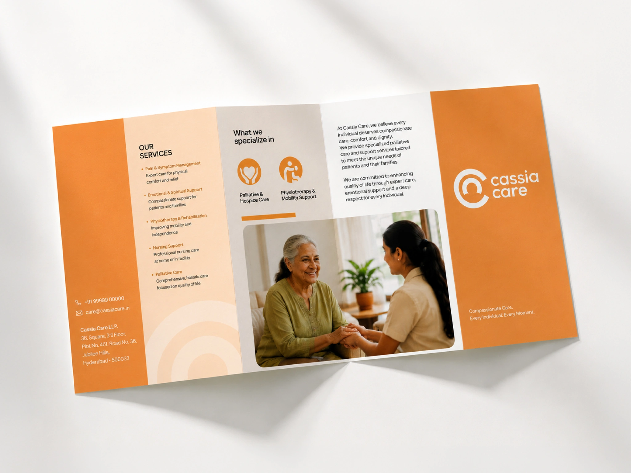
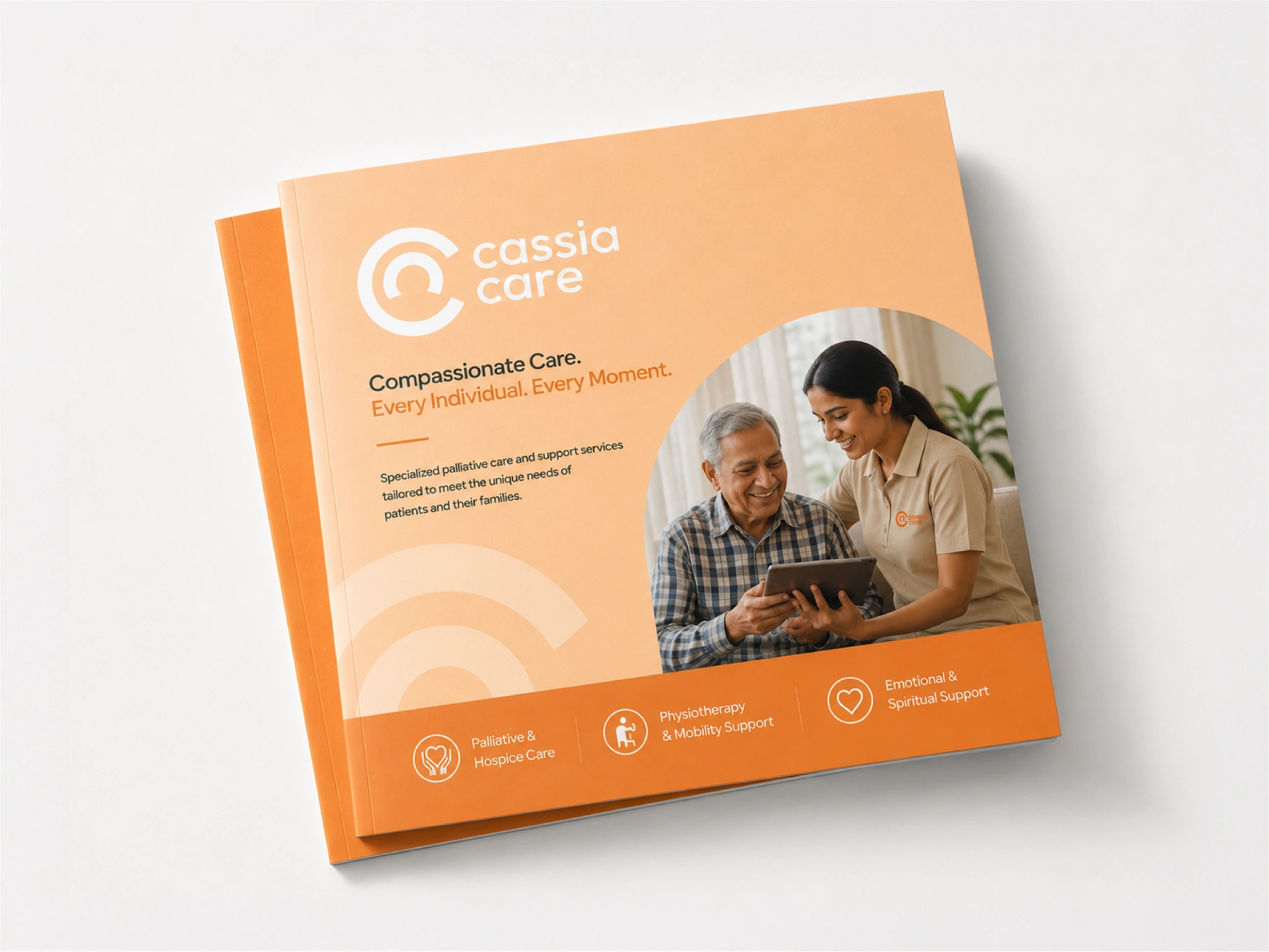
We focused on creating a brand world that felt gentle, safe, and human – in contrast to the often bland and sterile approach one can find in the healthcare sector. The visual direction leaned into rounded forms and a soft, pastel-based colour palette, designed to convey warmth, tranquillity, and emotional ease.
The solution
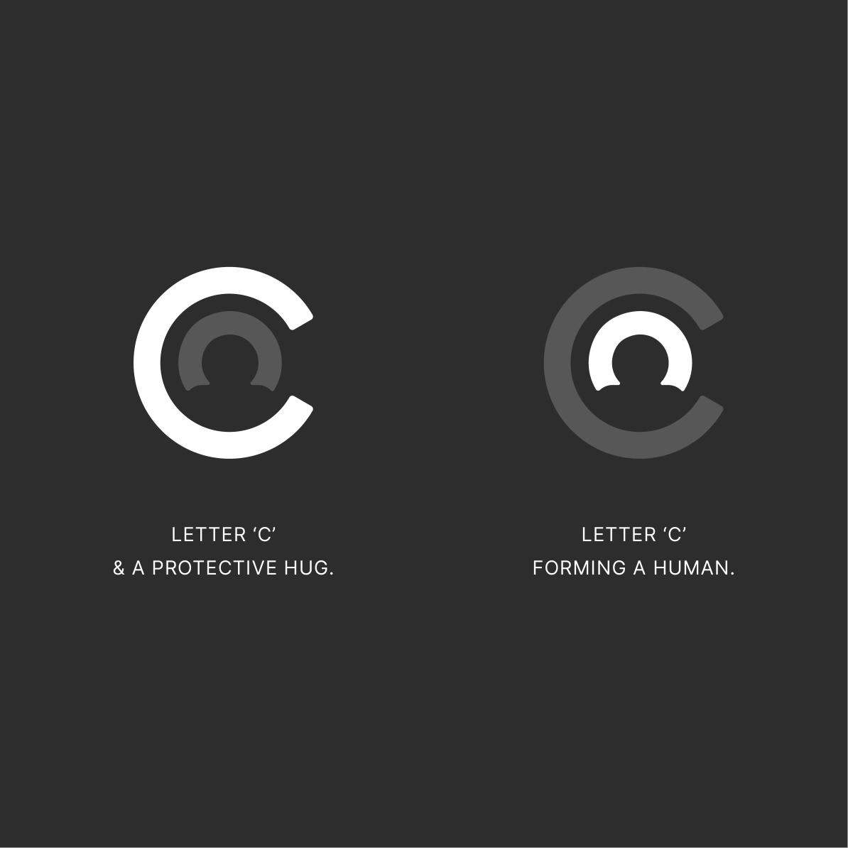
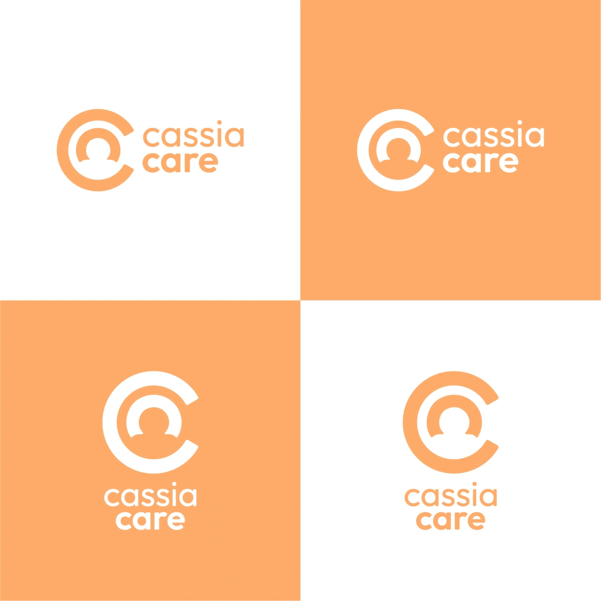
At the heart of the identity is a logo built with two “C” forms — one representing a protective embrace, the other forming a human silhouette. This simple yet powerful mark speaks to Cassia Care’s essence: compassion and care. Paired with the calming palette and friendly typography, the brand communicates professionalism with a deeply empathetic core – redefining how palliative care looks and feels in India.