Create a bold, fun, and disruptive identity for a fresh new D2C egg brand in India — one that could stand out in a sleepy category, appeal to health-conscious urban buyers, and build instant shelf recall without feeling too mass-market or old-school.
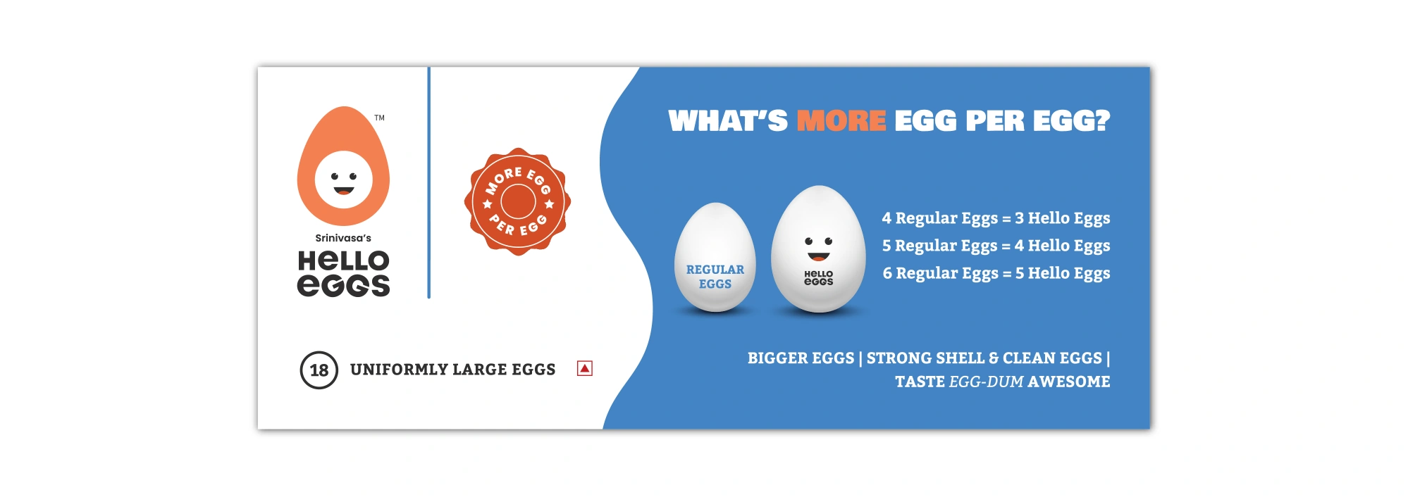
The product had a clear differentiator: bigger eggs laid by high quality Hyline hens. Now, could we deliver on the product’s promise through a great brand story?
The APPROACH
We leaned into playfulness — developing a brand persona that’s smart, quirky, and full of character. The idea was to break convention without breaking clarity. Every visual and verbal cue had to say: “We’re fresh. We’re fun. And we know our yolk.”
The solution
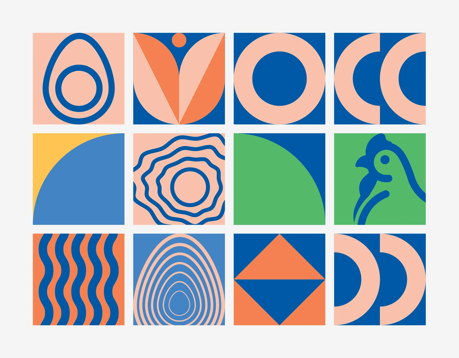
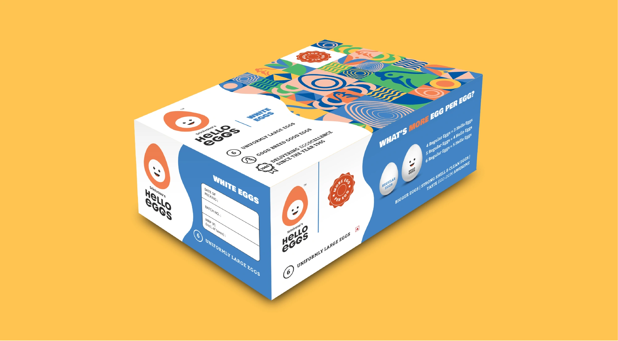
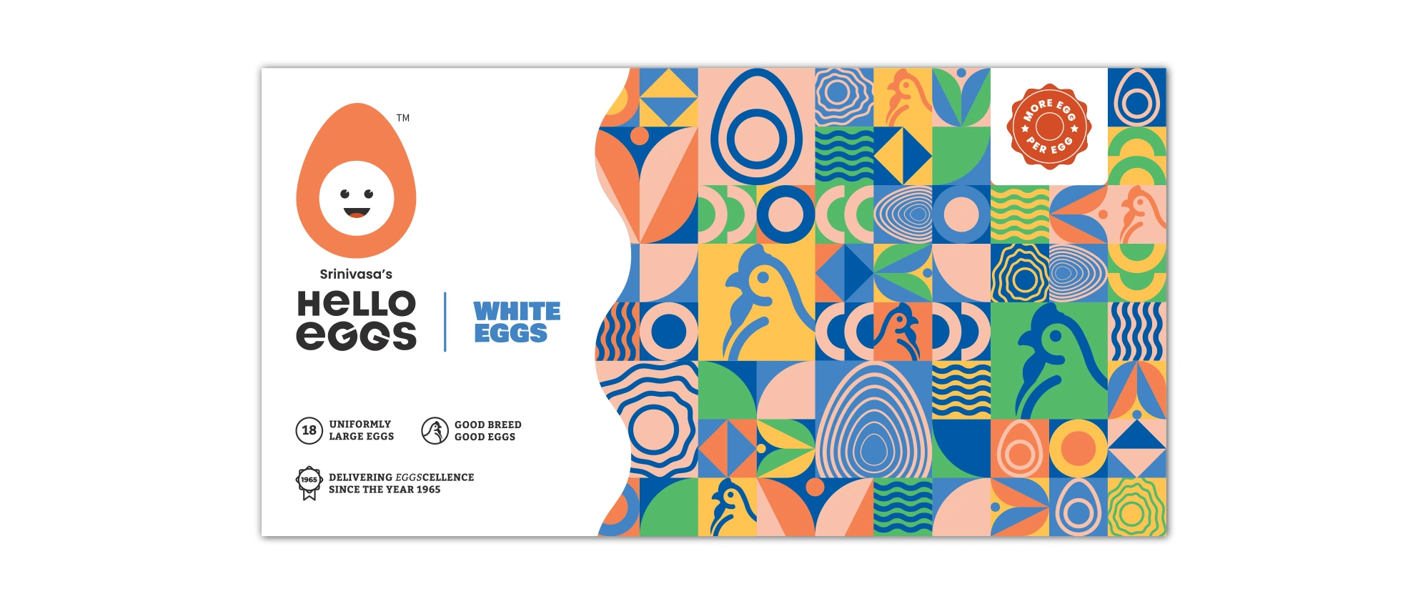
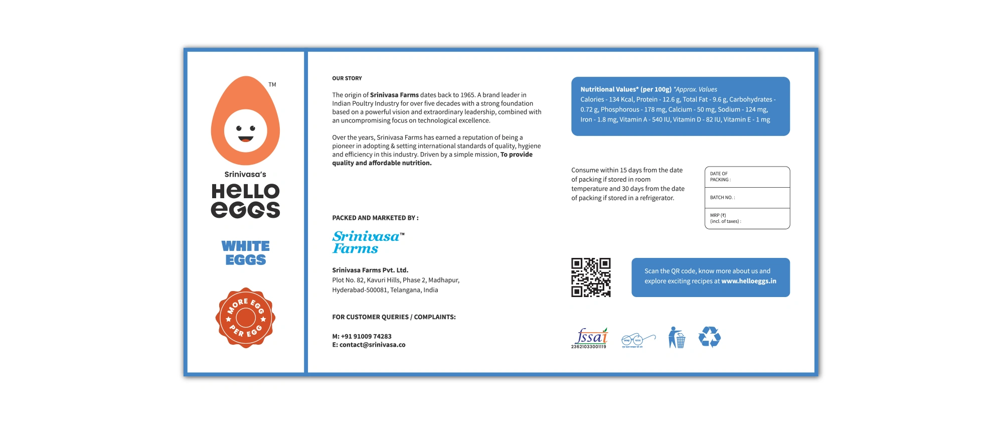
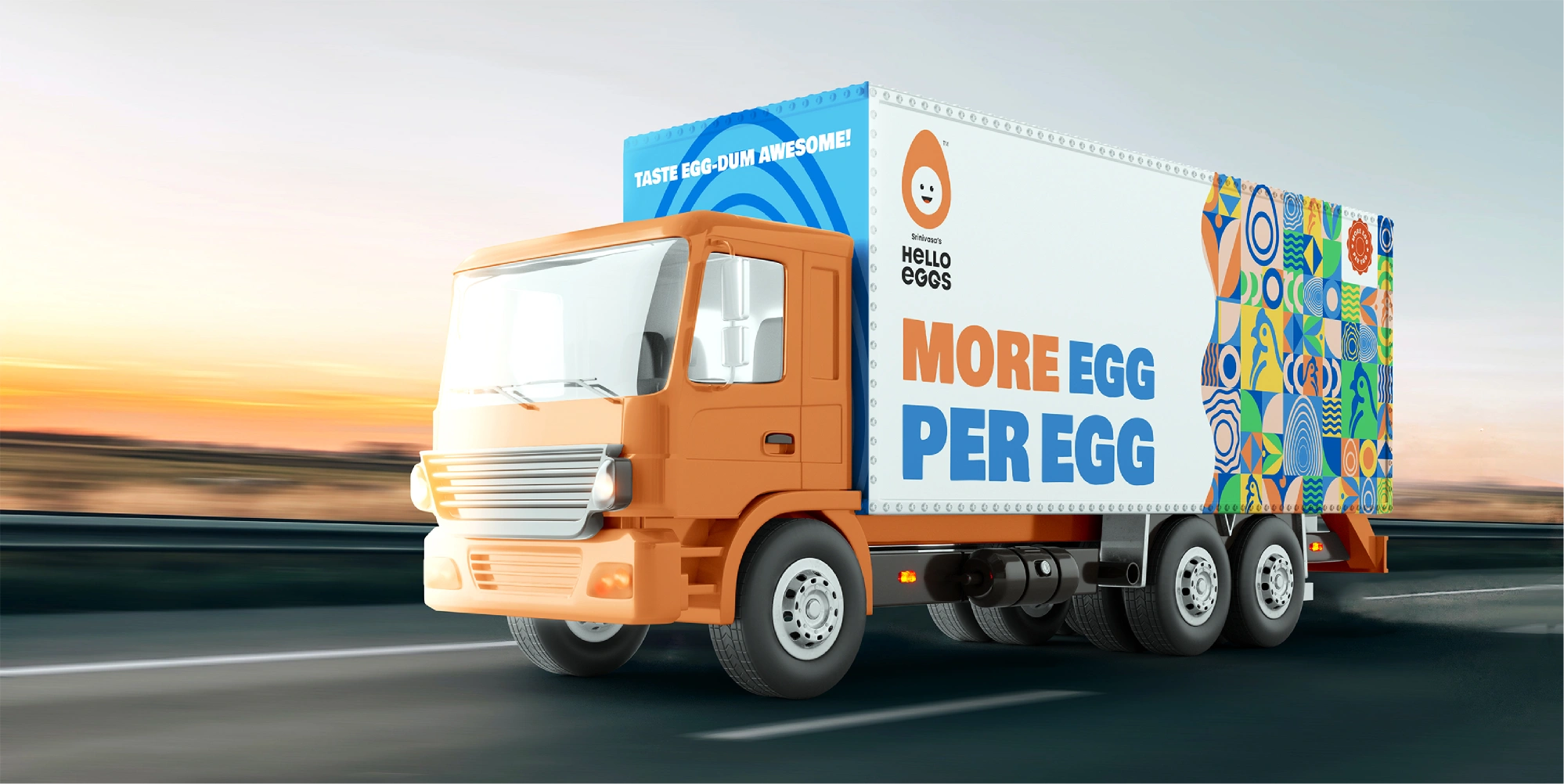
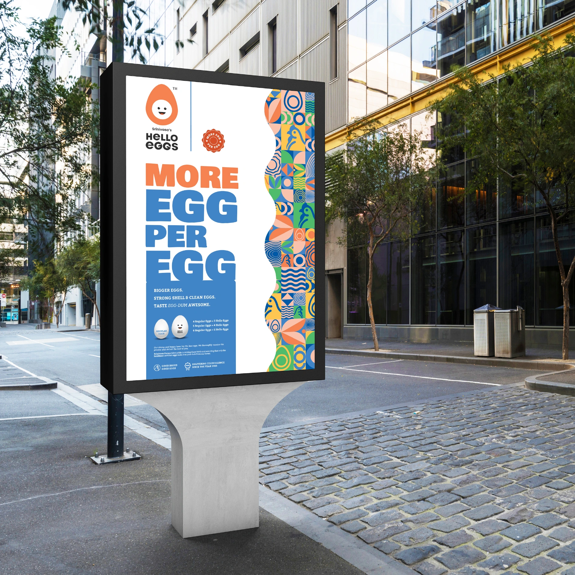
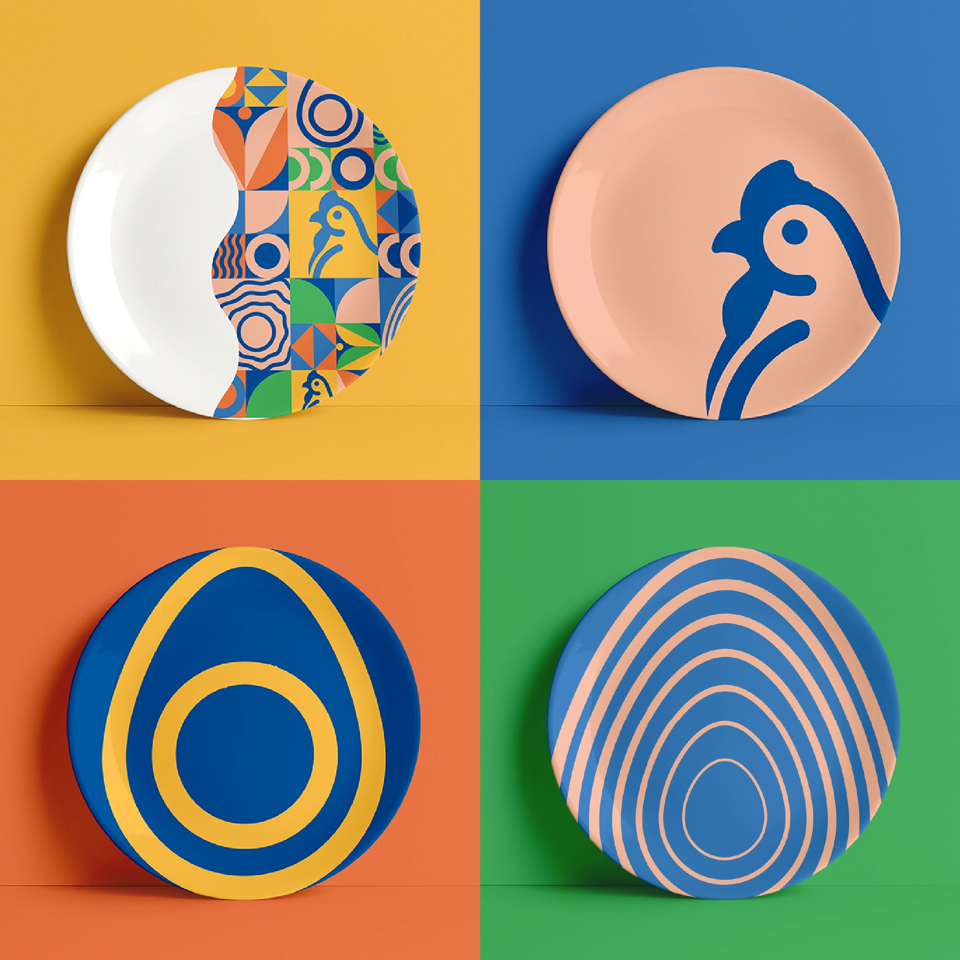
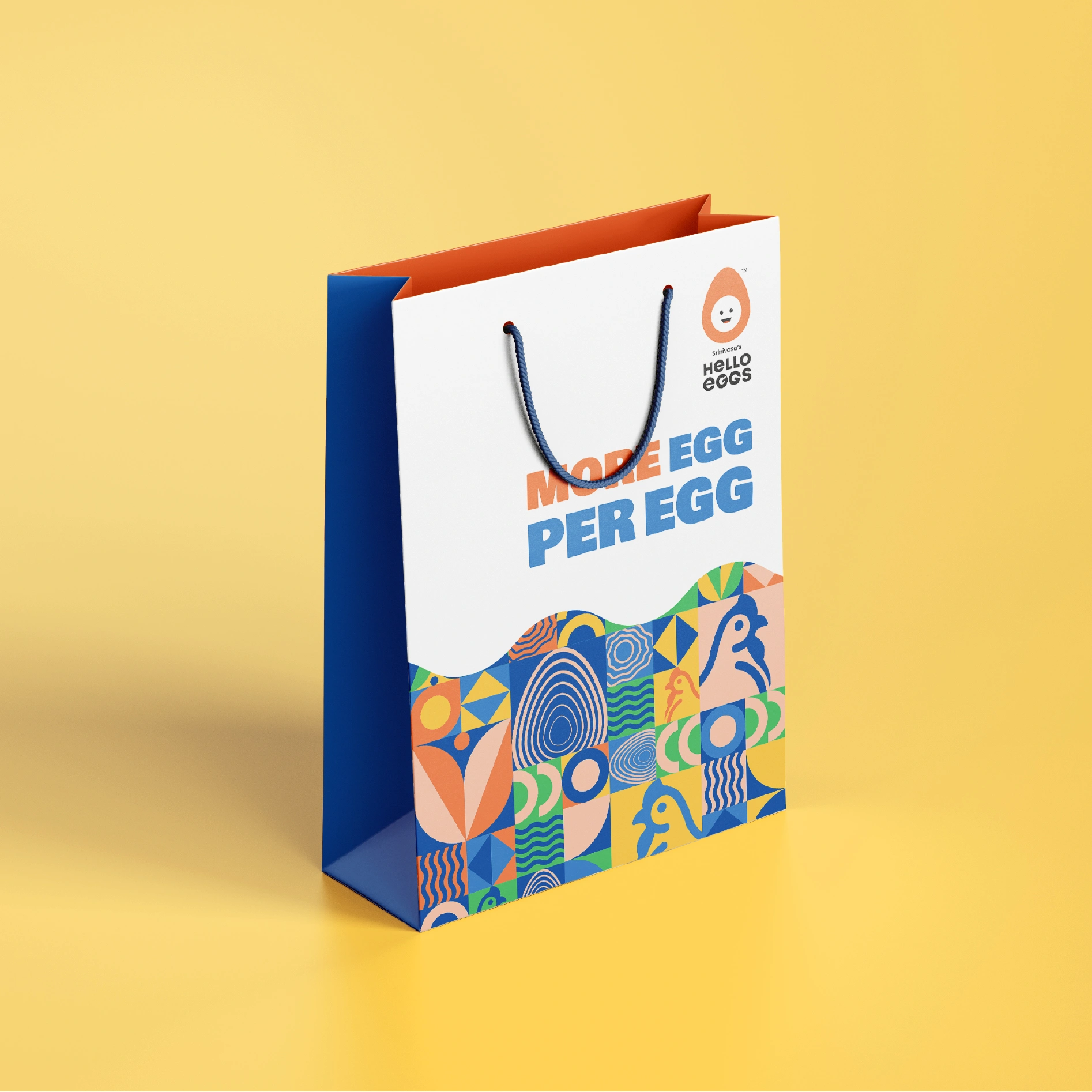
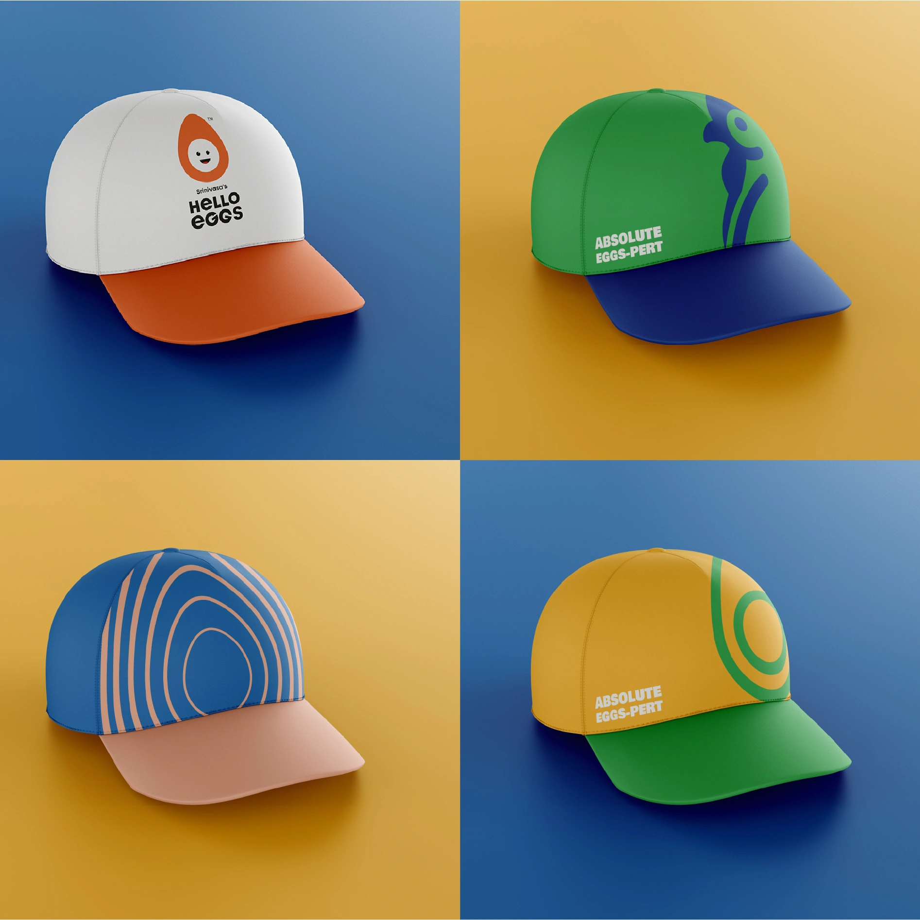
We built Hello Eggs as a brand that could crack a smile – literally and visually. The colour palette was chosen to be vibrant, cheerful, and breakfast-friendly – think sunny yellows, warm reds, and a bold use of contrast to make it pop on shelves. The patterns and doodles brought playfulness and life to every pack, while the tone of voice stayed witty, casual, and never tried too hard.
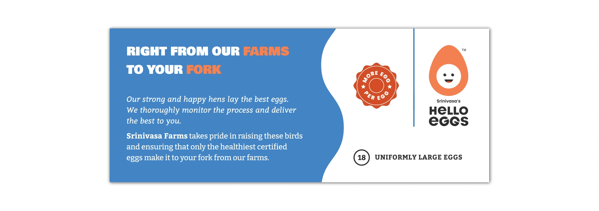
The real win was in creating surprise and delight through the packaging – from incorporating the brand colours with interesting patterns and bringing the brand’s tonality to life with each line of copy. We were not only packaging the eggs, we were packaging a mood and shaking up a category that was bland. It was personal, fresh, and just a little weird (in the best way).