
You may also like
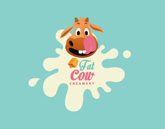
Fat Cow Creamery
Fat Cow Creamery is a concept based food truck that specialises in ice cream rolls and pops. All the ingredients are natural and freshly made everyday.
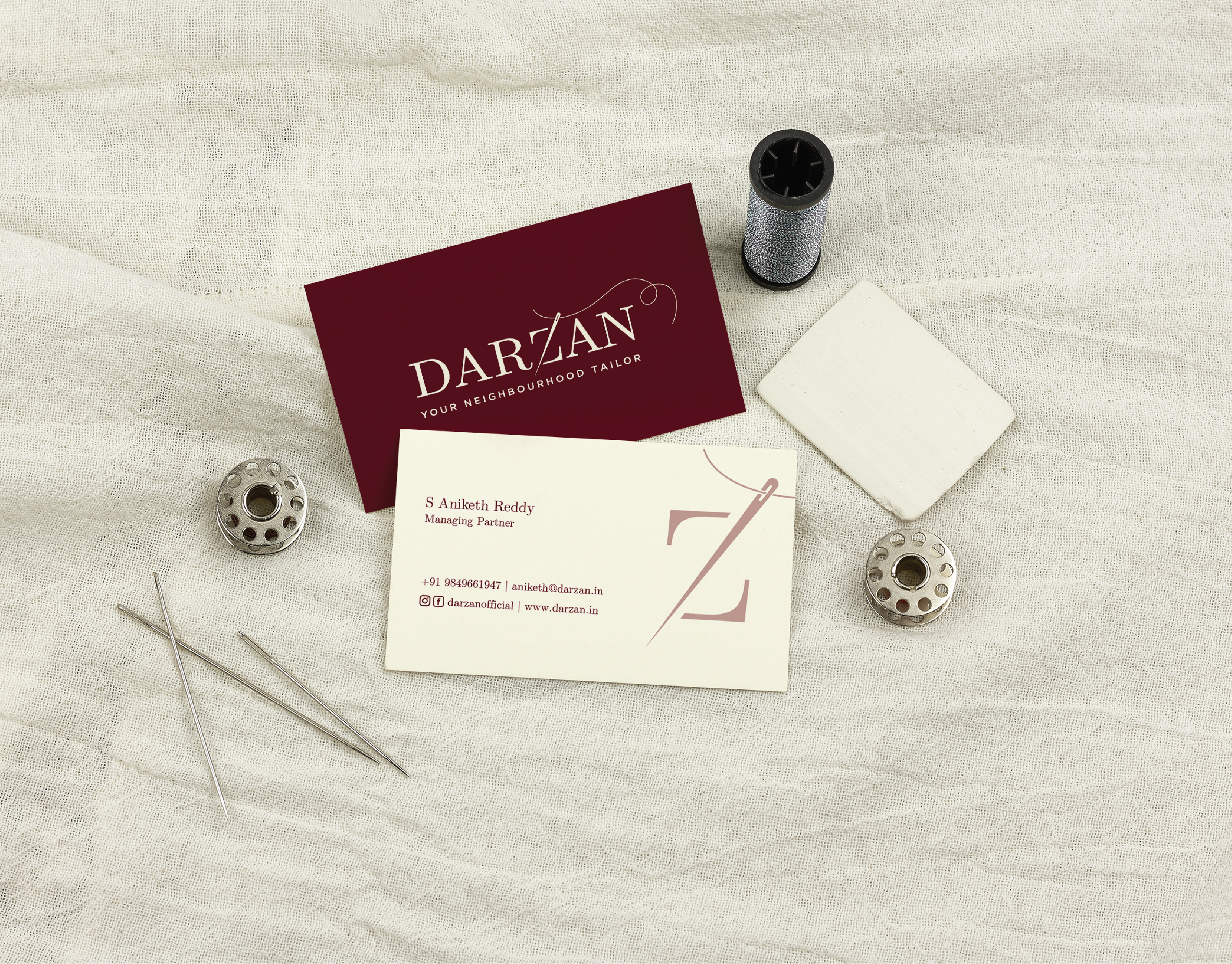
Darzan
We recently designed the brand identity for a high end tailoring store called Darzan, based in Hyderabad. The challenge was to design an identity that would emanate a feeling of luxury and trustworthiness. We did this by creating an elegant logo and pairing it with their tagline. We used the diagonal stroke of the letter Z to incorporate a needle to give the whole identity a right context.
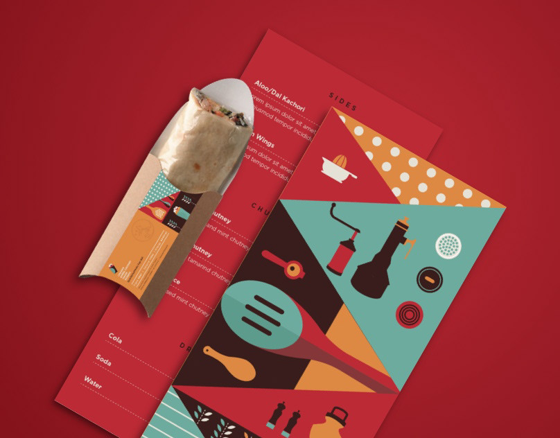
Spice n Soul - Takeaway
India is a Land of Colors. What better way than to put forth the quirkiness of India than through a plethora of colours! Young and Fun, the Identity is recreated to invite the young and busy to an offer of tasty takeaways.
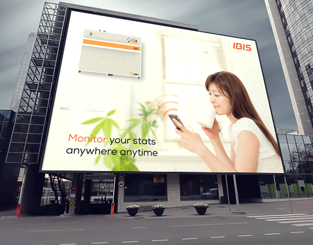
Cygni - Advertising
Cygni is a product based company that provides green solar energy and DC power at a very low cost.
They believe that there is a better way to power our homes and businesses at a much lower cost while contributing to a cleaner greener planet.
We worked on Web Banners, Emailers, Brochures and Social media posts for the company advertising. We decided to stick with Orange which is the brand color symbolizing solar energy which is the core of the brand.
The banners were made simple and minimal in order to convey the aspects of the product with clarity. The brochures were to convey the various product features and explain about the brand itself. We also worked on Emailers to update the new features and products to the world.
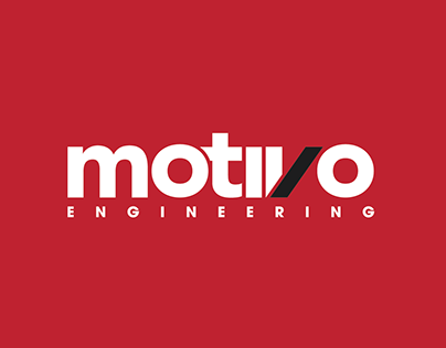
Motivo Engineering
ReBranding of Motivo Engineering.
Challenge
Motivo engineering is made up of passionate professionals wanting to be perceived as a talented and super cool, dynamic organization. To achieve, a revamp of the Brand Personality was order of the day; and that’s when we stepped in. The challenge was to create an Identity that would convey the intended message of a well-grounded solid structured company with an edginess of a Startup.
Approach
Understanding the Motivo way was the starting point, giving us enough to structure a course of Identity. Experimentation and Innovation were to be the precision points, as they were the backbone of the company. The Identity evolved to be bold and stable, through customized type. Slight inclination in the type, projects a motion, giving way to an evolutionary personality to the brand. Red reflects the ‘young’ while grey represents ‘solid’ making for a sharp and edgy Identity. The flow of the brand was further channelized into collaterals and web space creating a holistic experience for the customer.
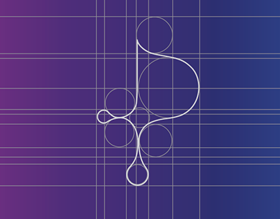
Printography
Printing and Ink are inseparable and eternally in love. A Print Brand must translate this union through its language and visual feel. Taking Ink as the
metaphorical element, the Brand feel for Printography is hence positioned to give the direct impact of what the Brand is all about. Giving an ‘ink drop’ that elevated status to form a ‘P’, signifies the union and gives Printography a very good recall value. Use of mixing colors further empowers the brand of its actual nature and the best it can deliver in quality and value.
Logofolio 02
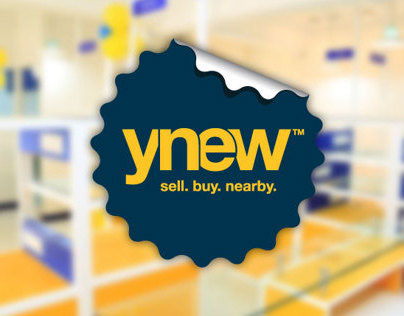
YNew
YNew is a new-generation Re-Commerce platform, first of its kind in India. YNew is an innovative local marketplace which is redefining the process of sale and purchase of used & refurbished electronic goods. They offer a unique platform for both buyers and sellers to transact pre-owned, refurbished and factory seconds lifestyle gadgets, which addresses a dual consumer problem.
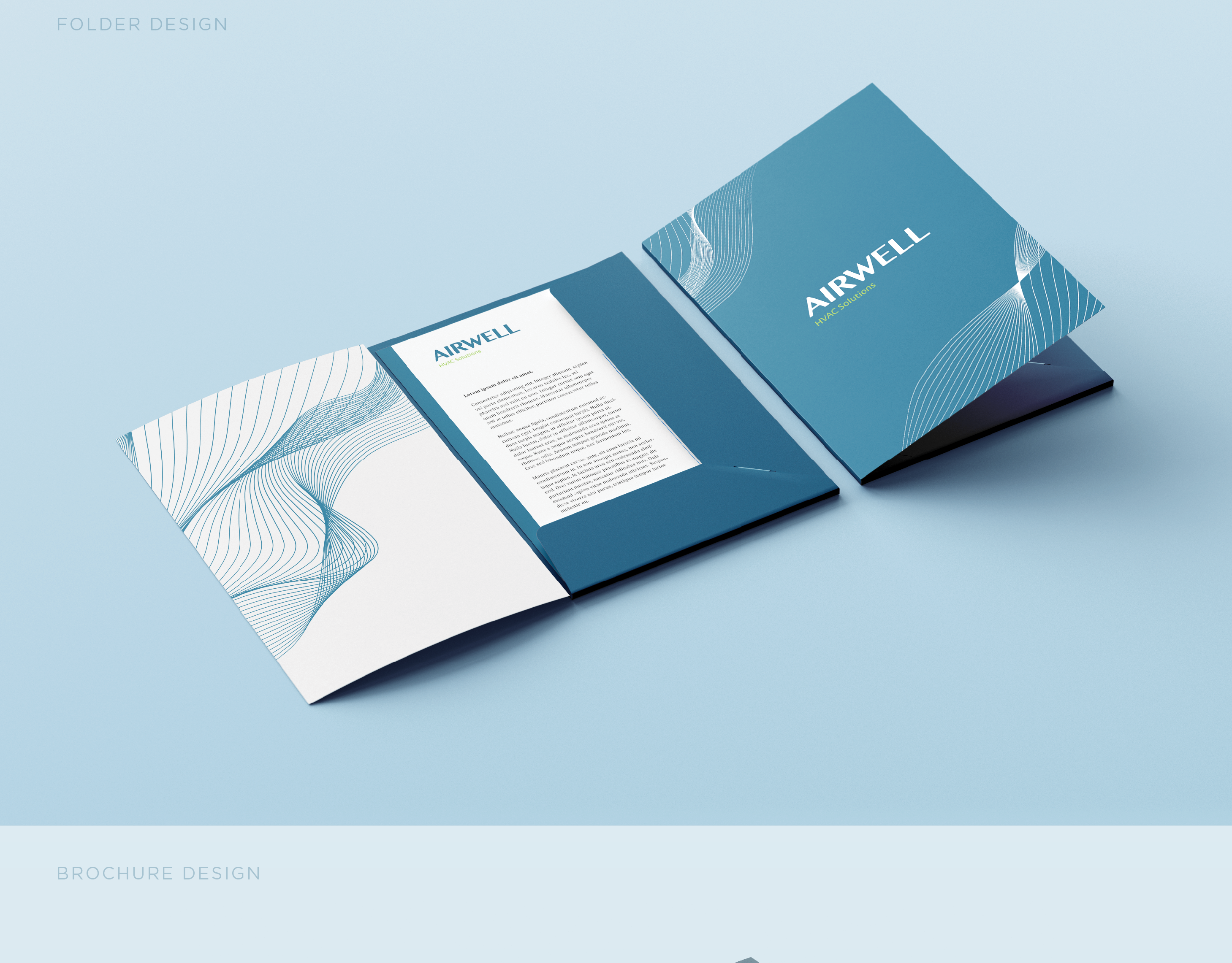
Airwell - Enviormental Design & Brochure Design
Airwell is an air-conditioning store. We designed the environmental graphics and brochures for the store. The brand focusses on clean air and how it is a prerequisite for good health and well being. The visual language is bold and clean to complement the message that the brand propagates. The cool color palette adds to the fresh and healthy feeling of the brand.
Logofolio 03